This is the second part of as many as possible in this series.
This is a short post with just one example ( unlike the previous post )
The previous post was around the theme of senses, and good design that impact(s/ed) our senses in daily life.
This one is a bit more generic, I’m going to be focusing on subtlety and things we miss in general, which fits into the broader theme of good design that goes unnoticed, but, I’m going to stretch it a little.
The theme this time around is,
Good design that goes so unnoticed that it loses its purpose
The Fuel Tank indicator
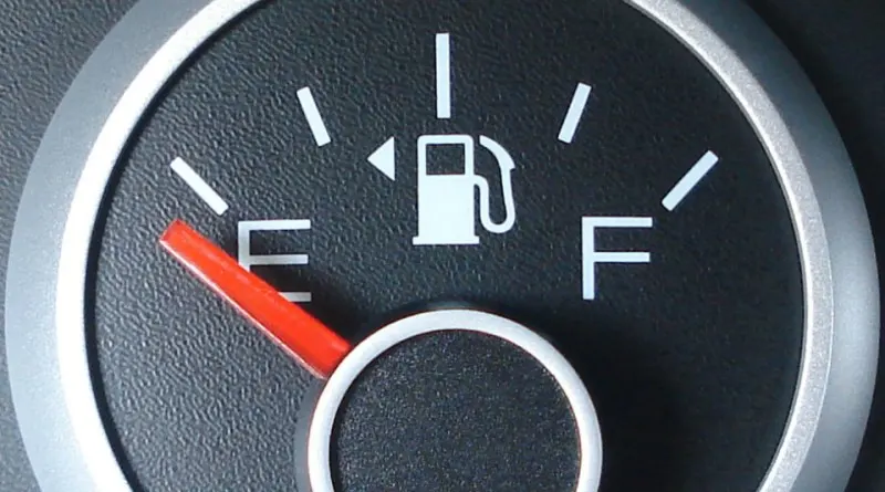 source: https://maphappy.org/2015/04/know-instantly-which-side-your-cars-gas-tank-is-on/Cars in general break a lot of design principles, they have way too many controls, too many functions and not enough simplicity.
But, if you get in a new car and need to fuel up, you head to a petrol bunk and suddenly you realise you don’t know which side the tank opens.
Well, look at your fuel indicator, there’s a small ‘arrow’ next to the fuel tank symbol in every car, that’s the side the tank is on.
It’s good design, is informative, non-intrusive etc, but, not very well communicated that it goes so unnoticed that it loses its purpose.
One of the fundamental problems with what I’m trying to do is, the things I’m trying to notice are by definition going unnoticed, so, maybe I’m getting better it? Only time will tell.
Until then, here’s some stuff for you to watch and read.
Content to consume
Here’s some design content to consume.
Book : The Non-Designer’s Design book
Documentary : The Sony Walkman : A BBC Documentary
Talk : Tony Fadell — TED Talk
Thank you for reading
Sainath